Awards
The Swiss Red Cross (SRC) is dedicated to helping people in need all over the world. To enable the organisation to fulfil its mission even more effectively via all its digital channels, we relaunched the centrepiece of the Red Cross universe, redcross.ch. In line with the SRC vision, the heart of this relaunch was people: The users visiting the website to obtain information or to find help for themselves or others, and also the experts, who poured their heart and soul into this project.
- Customer
- Swiss Red Cross
- Customer since
- 2020
- Go-Live
- December 2021
- Website
- www.redcross.ch
1
year of remote work
1.7
times as many women as men involved
16
subsites integrated into the main site
<3
most frequently used emoji in online meetings
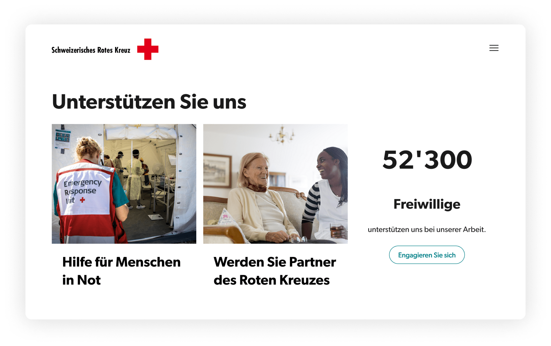
A Human-centred Approach
People visit redcross.ch to get support or obtain information: They want to donate, get involved or find specific information. The target groups have different needs. To help users find the right information with just a few clicks, we developed a navigation and content concept that is based on simple, recognisable structures. Content that is easily comprehensible combined with an intuitive design helps users find their way on their journey through the Red Cross universe.
Just like users, web editors appreciate clear-cut processes. The content concept enables them to enter content into the content management system in an easy and automated fashion.
We worked with a human-centred design approach to better understand and meet the needs of all target groups. To do this, we used a mix of different methods, including expert analysis, interviews, audits and workshops.
A Website for Ten Target Groups
On its website, the Swiss Red Cross addresses ten target groups. They roughly fit into the three categories of consuming, donating and curious users with very different needs and goals. In workshops, we defined the target groups in more detail to get a better understanding of them. In a second step, we drafted at least two customer journeys per target group. We asked ourselves throughout how users would feel on a page, and what they would think, see and do. These customer journeys then gave us elements and functions we would need on the website.
A Star With Many Satellites
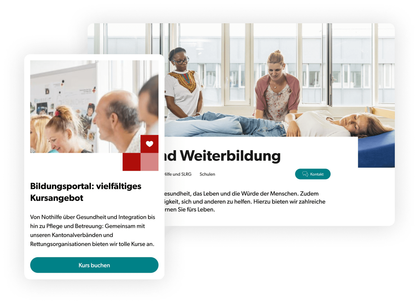
Previously, the Red Cross universe consisted of the main site at redcross.ch and almost 30 subsites, called satellites, for specific subjects or campaigns. This convoluted structure with main sites and subsites made it difficult for users to find their way around the Red Cross universe. To reduce the number of satellites orbiting redcross.ch, we restructured the sites. 16 satellites were integrated into the main website, and content was tidied up and reduced. Where they served a purpose, we left the satellites in place and moved content from the main site to these satellites. New, appealing teasers on the main site now link to these. The comprehensive course programme offered by the Swiss Red Cross, for instance, is no longer displayed on redcross.ch pages, and instead, users are forwarded to the redcross-edu.ch satellite for all questions on training and education.
Clear Structures Guide the Way
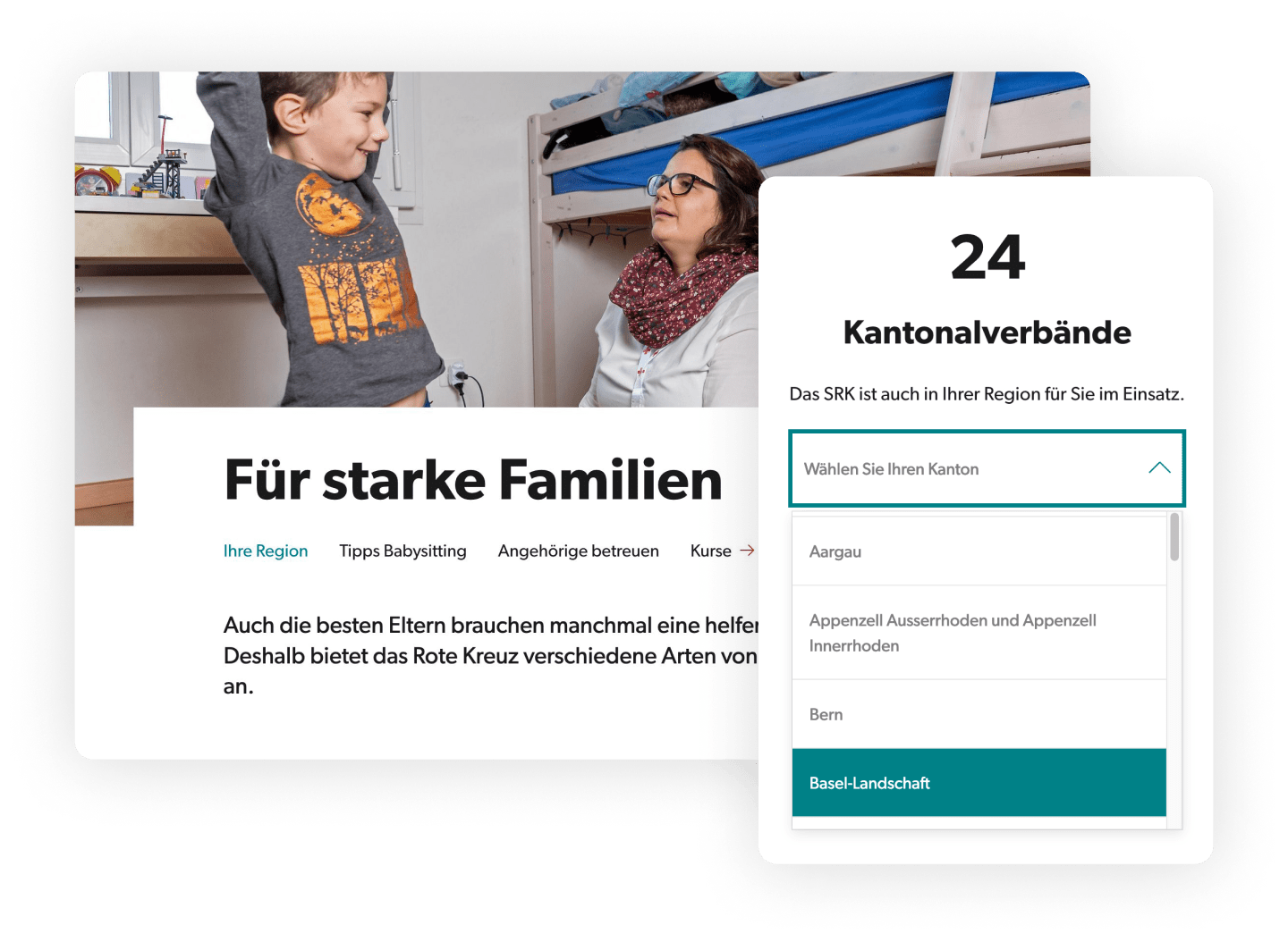
As well as the new structure, the architecture of the sites themselves also helps people find their way. We defined content types with fixed structures to enable users to get their bearings quickly. Whether it is aid projects, feature stories or pages with assistance programmes, every content type has its own, distinct structures. Also, every page is dedicated to a main goal or a main action, depending on its content. While a page on an aid project is primarily aimed at generating donations, another page may be dedicated to winning customers. An example of one of these «portfolio pages» is the «strong families» page. This page lists assistance services for childcare and useful tips for hiring a babysitter.
We also improved the integration of the cantonal pages. They are now available from a drop-down menu on the start page and on subpages with relevant topics.
Strategy-based Content Optimisation
Structures, processes and people all influence content quality. Which is why we tackled these parameters in content audits, workshops and content training sessions. We drafted a content strategy and used it to derive guidelines for text generation. This helps editors create new texts for pages and simplify or thin out existing text. Less complex sentences, less bureaucratic language, a more active voice and a more comprehensible style. The goal of all these efforts was to offer the best possible experience to users through the choice of words, modules and the site structure. To help optimise the text for search engines, we conducted SEO training sessions. We supported editors in adding the right keywords to their texts.

Accessible and Comprehensible for All
Not all users can see (or see colours) or understand our official languages. To help people with visual, cognitive or linguistic impairments find the right content, we made redcross.ch accessible to everyone. We trained the Red Cross editors in improving pages through structure and simple language. We paid particular attention to descriptive alt texts and meaningful titles and links. Certain pages on redcross.ch will soon also be available in German ‘plain language’, a simplified form of the German language. With its high-contrast colours and large typography, our design concept also contributes to accessibility.

Every Colour Serves a Purpose
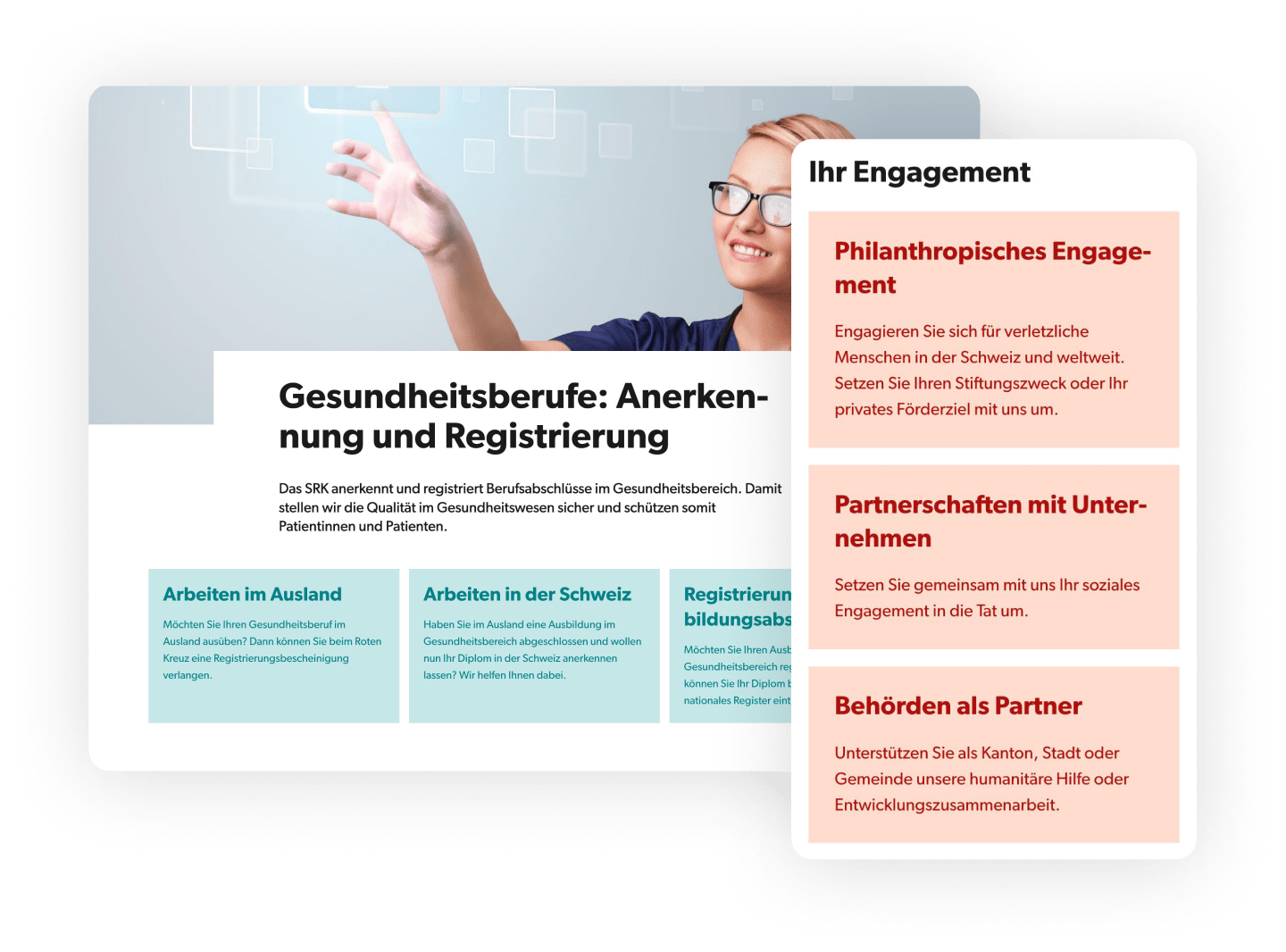
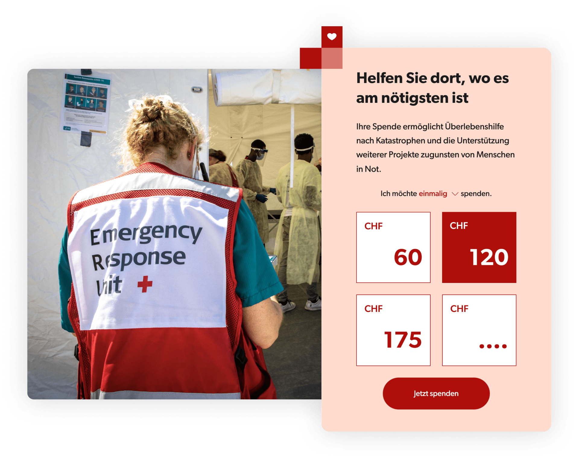
Content before design: Following this principle, we drafted a modern design concept that helps convey content. Clear, recognisable structures that don’t distract from the key message, and a use of colour that helps users navigate the site are part of this concept. The main colours are red and turquoise. Red carries emotions, which is why the donation teaser on every page is red. Turquoise, on the other hand, elicits trust. That is why the contact button is always turquoise. This way, the design concept also supports the site architecture, which allows for one main action on every page.
The Red Cross of Swiss Red Cross
The red cross is a trademark and the distinguishing mark of the Swiss Red Cross. In war times, its essential task is to protect civilians and humanitarian personnel. This is why it cannot be used anywhere on the website apart from in the logo. Instead, red squares recall the red cross. In different variations, the square is used in all brand-relevant parts of the page, such as the donation teaser with the heart icon.
Validation in User Tests
We performed user tests to find out whether the concept works and whether users can find the right information on the site. In addition, we validated key processes such as the donation process. We complemented these tests with interviews before and after. The results have shown that the website is perceived as modern and well-structured. The concept and design are serving their purpose. They have also shown that content is tremendously important and texts need to be comprehensible.
Measure Progress Towards Goals
The Swiss Red Cross has specific online targets for this website, such as gaining donors or promoting volunteering. To measure the progress towards these goals after go-live, we defined key performance indicators (KPIs) along with the online goals. As well as measuring success, these KPIs now also serve conversion optimisation. Most of the KPIs are tracked with Google Analytics 4. This is a big step towards data-driven marketing for Swiss Red Cross. Dashboards with the most important KPIs will support future data-based decision making. The standardised data layer provides solid tracking that will scale effortlessly in the future.
Remote, Yet Close
For more than a year, we worked remotely with the Swiss Red Cross staff. Thanks to collaborative tools such as Microsoft Teams and Miro, as well as the goal-focused project setup with split responsibilities based on subjects, collaboration was excellent. We replaced physical with virtual post-it notes and pats on the shoulder with heart emojis after presentations. It made our first face-to-face meeting towards the end of the project all the more joyful.
The new website is a milestone for online communication for the Swiss Red Cross. Unic consulted with and challenged us and coached us through to the go-live and beyond. The entire project team always took our individual needs and structures into account.
Sabrina Hinder
Head of General Communication and History, Swiss Red Cross
Contact for your Digital Solution
Book an appointmentAre you keen to talk about your next project? We will be happy exchange ideas with you.


Contact for your Digital Solution with Unic
Book an appointmentAre you keen too discuss your digital tasks with us? We would be happy to exchange ideas with you.