

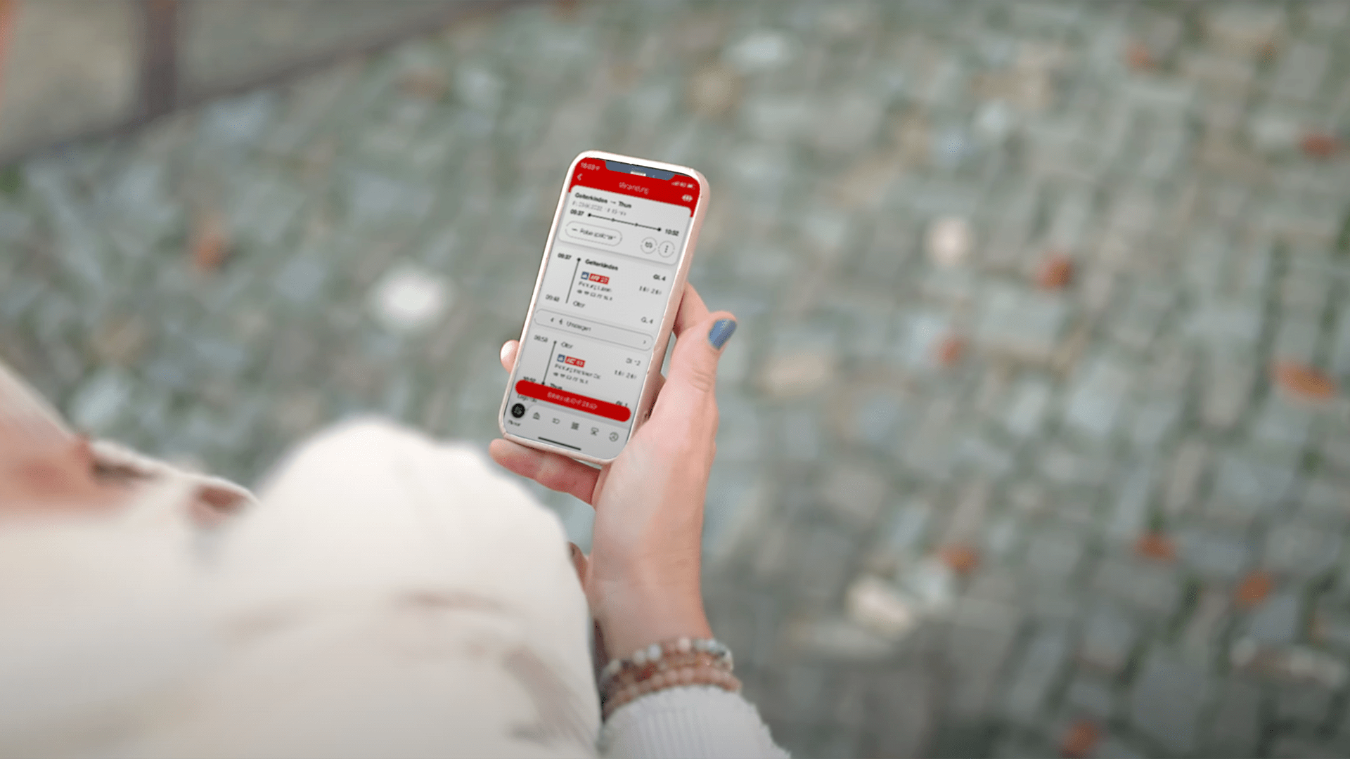
The SBB Mobile app is one of the most successful digital applications in Switzerland, boasting an impressive 3.5 million active users monthly and 300,000 tickets sold daily. As the highest-grossing sales channel of Swiss Federal Railways, it is at the center of public interest.
This naturally creates considerable pressure: How does one handle the situation when it feels like half of the Swiss population is discussing and criticizing? How can one redesign the country's most popular application while all of Switzerland closely watches every development step? The successful redesign of the app demonstrates how these unique challenges can be mastered.
Always by Your Side
SBB Mobile personally accompanies travelers - before, during, and after their journey. This vision was the guiding star for the entire team and especially for me as a UX designer during the redesign. The particular challenge: Users were familiar with the existing app. They knew exactly where to find each function, were accustomed to the timetable, and could quickly access the desired information. We wanted to build on this high level of satisfaction with the new app. Therefore, we developed a gentle redesign that doesn't turn everything upside down but still allows room for new features.
SBB Mobile is the personal digital travel companion for every public transport traveler in Switzerland.
-- SBB Mobile Vision
Everything Important at a Glance
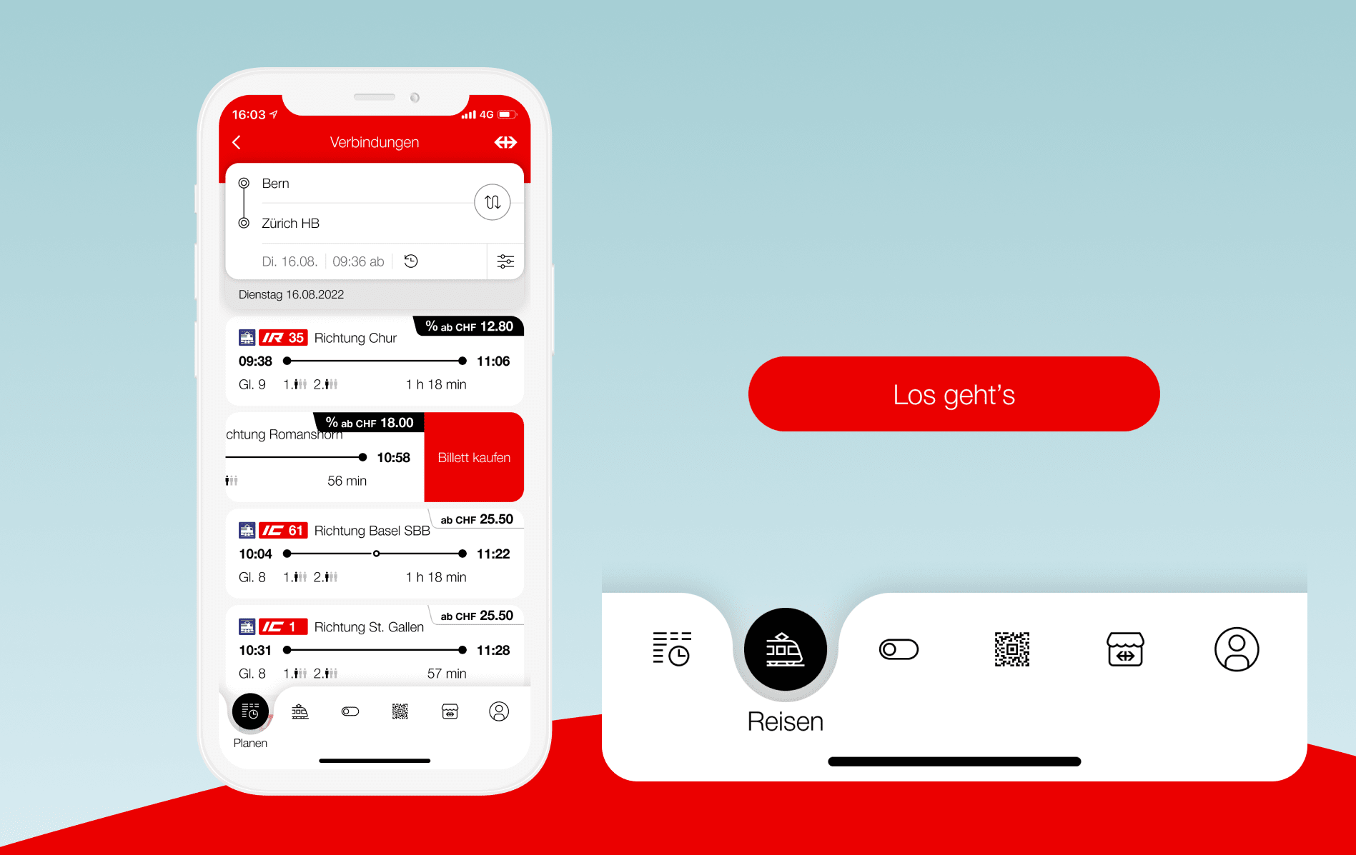
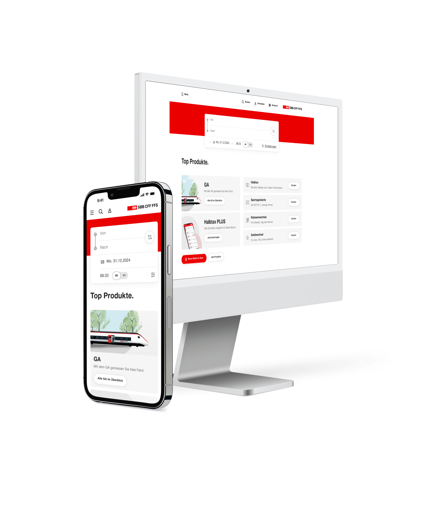
Perhaps the most noticeable change is the new navigation structure. The hamburger menu in the top left and the home page have been retired. Their successor is the new tab bar at the bottom of the screen, familiar from many apps. It is the heart of the redesign and provides direct access to the app's core functions from anywhere. "Surprising and a bit unfamiliar at first" is not an uncommon feedback I hear, followed by praise and an "but I got used to it quickly."
Users need to familiarize themselves with the new order and the six different tabs to be able to buy a ticket at the last second while half-blindly running for the train. Because that's the true value of the app, in my opinion.
A Well-Rounded Affair
A closer look reveals the rounded shapes in the new design style. Where tiles and corners once dominated, subtle rounded corners on UI elements now create a pleasant appearance. The user interface feels organic and friendly, and is intuitively usable for different age groups. This is particularly important because the app aims to satisfy a wide range of target groups: from teenagers to seniors, everyone should feel comfortable.
Before, During, and After the Journey
User interfaces are ideally minimalistic, as this makes them more user-friendly. But they should also evoke positive emotions by being aesthetic and entertaining. The modern, minimalist style enriched with illustrations brings both together in the SBB Mobile app. Illustrations of everyday situations make users smile and support the comprehensibility of the content.
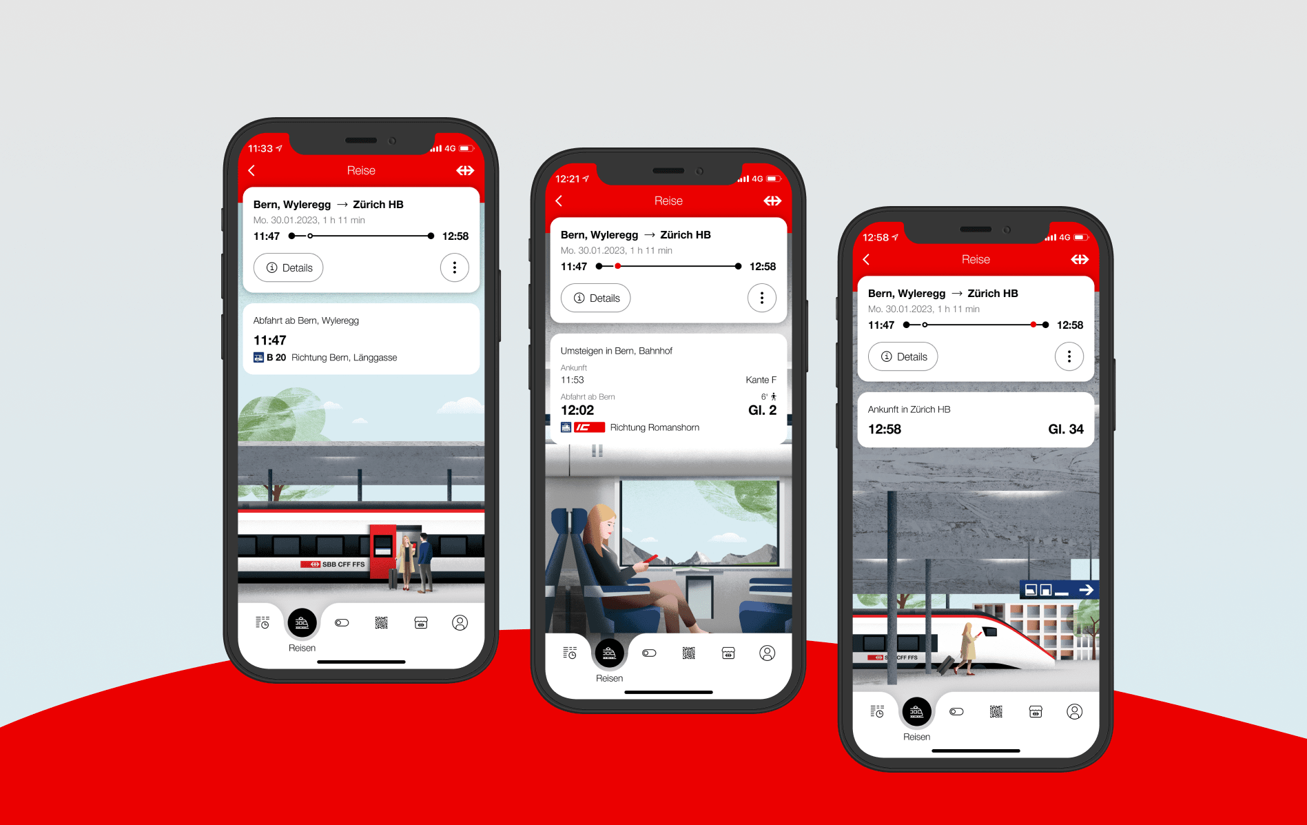
The different elements of the design are conceived as movable parts. They connect to tell a story. This is particularly evident in the illustration of the travel companion: Before the journey, you see a woman on the platform saying goodbye. During the journey, you see her sitting on the train. After the journey, she leaves the station. The illustrations change in real-time according to the saved journey, using the travel companion in a lighthearted way.
The Right Visualization for Every Situation
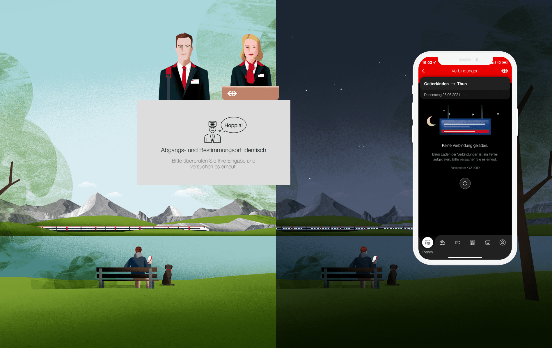
Who still remembers the small symbol in the form of a customer attendant's head - affectionately called "Oops-Man" by many? The little man always appeared - whether it was an error message or a confirmation. This generic use sometimes led to confusion and unnecessary inquiries to the SBB Contact Center.
In the redesign, the customer attendant received a fresher look. At his side, the woman at the counter alternately appears. Both humorously support hints or success messages in the app. Error messages are displayed with the typical SBB display board with the red disruption message. This illustration creates a recognition effect from the real world and conveys the negative message even without reading the text.
Illustrations Evoke Emotions
Users' attention spans are often incredibly short. Illustrations are an efficient way to convey information at a glance. Moreover, illustrations and animations create beautiful little moments that become an experience. With their playfulness and friendly atmosphere, they shape users' memories. I find it desirable to create something that is not only functional but also likable and unforgettable. In close collaboration with the illustrator, I was able to provide these creations and incorporate them into the design. The SBB brand has retained its high recognition value, but stands out with this new design element in the app.
Consistent Down to the Last Detail
Empty states, error messages, confirmation screens, and feedback have gained new value through illustrations. Rounded shapes led to a pleasant appearance. But that's not all. Through micro-interactions, the user is guided even more strongly. Whether digital natives or older target groups - micro-interactions are immediate and universally understandable feedback to an action for all users. For example, those traveling with EasyRide can see from the state of the EasyRide icon in the tab bar whether the check-in is still active. Those who buy a ticket recognize where the ticket has landed through the small red coachmark in the tab bar. Tiny details, but they make a significant contribution to finding one's way in the new system.
Furthermore, we worked on adapting the corporate design for light and dark modes. Very carefully, all screens with different states were previously adapted to the so-called dark mode. Dark mode is a design trend that has spread rapidly. On the one hand, it can save power, and generally, it's considered gentler on the eyes. Of course, all illustrations were also specially developed for dark mode. The starry sky or the street lamp shine, and the little stories get new room for interpretation once again.
What I personally like very much about the app is the attention to detail. Despite the strict SBB corporate design, many unique and new elements are used.
-- Natalie Kauer
Senior User Experience Designer
Learning from Travelers
The beauty of digital products: They are never finished, and you can always develop them further. The Gold award in the Usability category at the Best of Swiss Apps 2022 was an important milestone. We are incredibly proud of this jury verdict: "The most used app in Switzerland, SBB Mobile, comes in a new edition. It shows a high level of maturity. The proven functions remain the same, with few improvements in the user experience. At the same time, user guidance has been improved to create space for more relevant information. The 'Save Journey' function, which now works without login, stood out. Commuters will enjoy the app. Everything done right, which is not a given."
But we don't want to stop at this point, but rather continuously develop the app: SBB still has a lot planned and tries to implement customer feedback within the possible framework. Now, experiences with the use of the app are being collected and evaluated, and the vision is being pushed forward. I'm excited to see how the app will change and look forward to working intensively on it.
Contact for your Digital Solution with Unic
Book an appointmentAre you keen too discuss your digital tasks with us? We would be happy to exchange ideas with you.


Contact for your Digital Solution
Book an appointmentAre you keen to talk about your next project? We will be happy exchange ideas with you.